Enable DevOps engineers to automate a full-stack workload in one work day
Company / IBM
Role / Designer working with a senior designer, a content designer, a researcher, a product manager, and 4 developers
Tools / Sketch, InVision, Whimsical, Slack, Box, WebEx, Trello
Timeline / 9 months
One of the key responsibilities of a DevOps engineer is to create a full- stack workload for the company they’re working for. In other words, they’re the ones setting everything up backstage, so that you can access Netflix or Slack or Zoom 24/7, with no interruptions.
However, as you can imagine, this is no easy feat. It can get tedious really quickly, especially when it involves setting up hundreds, or even thousands, of machines.
Thus, I was part of a project to offer support for Ansible automation capabilities on IBM Cloud.
Context
The Apple Shortcuts app is a great example of automation
Cloud computing can get complicated, so let me set the scene for you with an analogy.
If you own an iPhone or iPad, you’ve probably seen, or even used, the Shortcuts app. I think this app is totally underrated, because it has some really cool capabilities that most people don’t know about.
For instance, you can create a shortcut where every time you say “Hey Siri, I’m getting pulled over,” your phone will automatically send your location to a specified emergency contact, and start taking a video with the front camera.
Now, imagine if you had to do these things as you saw the red and blue lights flashing in your rearview. You’d probably be way overwhelmed, right? 😫
The Shortcuts app is a great example of how automation can really come in clutch in the consumer space.
Apple Shortcuts app : consumer :: Ansible : DevOps engineer
Similarly, DevOps engineers get way annoyed with having to do certain tasks by hand.
However, instead of telling Siri to send their location or take a video, they ask Ansible (an automation tool) to install web servers and create databases.
Now, installing a web server or creating a database in the first place is no easy task. But imagine doing that up to hundreds of times?

Spoiler alert: it’s not very fun. That’s where Ansible really shines. It takes something difficult, and turns it into an easy and repeatable process.
Goal
Okay, now that you understand why Ansible is so great, you understand why it made sense for us to support Ansible on IBM Cloud.
Our goal was then to figure out what the Ansible experience would look like on IBM Cloud.
At some point, a designer had to determine how users would access Gmail (an existing service) on iOS. Similarly, we had to figure out how users would access Ansible (an existing tool) on IBM Cloud.
At the beginning of the project, there were two directions we could’ve gone in: aligning with IBM Cloud or aligning with Ansible. I explored both.
Exploration 1: Align with IBM Cloud
Whenever you create or buy something on IBM Cloud, you generally follow this pattern:
- Click on the Create button.
- Go through the create flow.
- Land on the resource detail page, where you can edit things.
I mocked up a create flow that aligned more with existing IBM Cloud patterns. However, I noticed that this exploration had inconsistent create and edit experiences.
Now, this is great if you’re buying something (like a Kubernetes cluster or a virtual server) and you need to perform a transaction with the customer.
However, if we’re talking about creating something that’s free (like an Ansible playbook), it doesn’t really make sense to create things one way, and then edit things in a completely different way. This just ends up increasing the cognitive load for the user. In other words, it’s bad UX 🙅🏻♀️
Exploration 2: Align with Ansible
Next, I looked at Ansible. Here, the experience of creating something is identical to that of editing something.
I mocked up a create flow that aligned more with Ansible patterns. Although this exploration had consistent create and edit experiences, it did not afford many opportunities to guide the user through the create process.
It’s like when you create a data table on Excel. When you want to edit that data table later on, you know exactly how to do it, because you had gone through the same process to create it.
So that was good. The user didn’t have to go through another learning curve to edit something.
However, I found that this flow gave little opportunity for us to guide the user through the create experience 🤔
Exploration 3: Combine the two previous approaches
So — you guessed it — I looked into combining the two approaches.
Although I had initially wanted to do away with the create page completely (so that we could have more consistent create and edit experiences), this would have been completely inconsistent with IBM Cloud’s existing create patterns.
Thus, as a compromise, I intentionally designed the create page to be as minimal as possible, so that the bulk of the create flow would actually reside on the resource detail page.
While I had initially wanted to do away with the create page (second screen) completely, I realized this would have have been completely inconsistent with IBM CLoud’s existing create patterns. Thus, I ended up intentionally designing the create page to be as minimal as possible.
Moreover, I also had to figure out how to guide the user through the create experience (as opposed to just throwing them into the deep end and having them figure it out for themselves). So here are a few high-fidelity changes that I made:
Version 1
Version 2
For each step, I added a number and a progress indicator icon. This way, from the user’s perception, instead of landing on a page with a bunch of section headings, they would land on a specific step they were supposed to focus on in the context of a linear progression.
Version 1
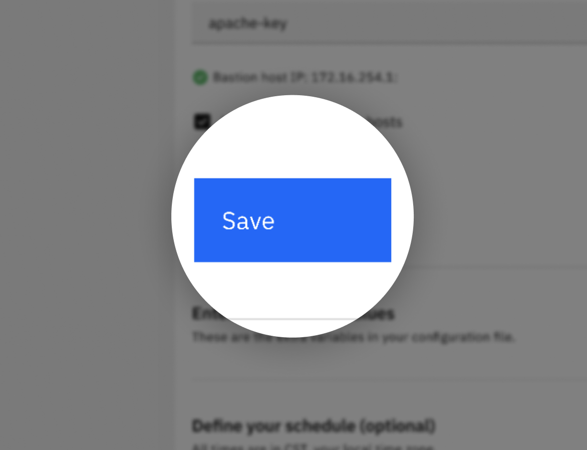
Version 2
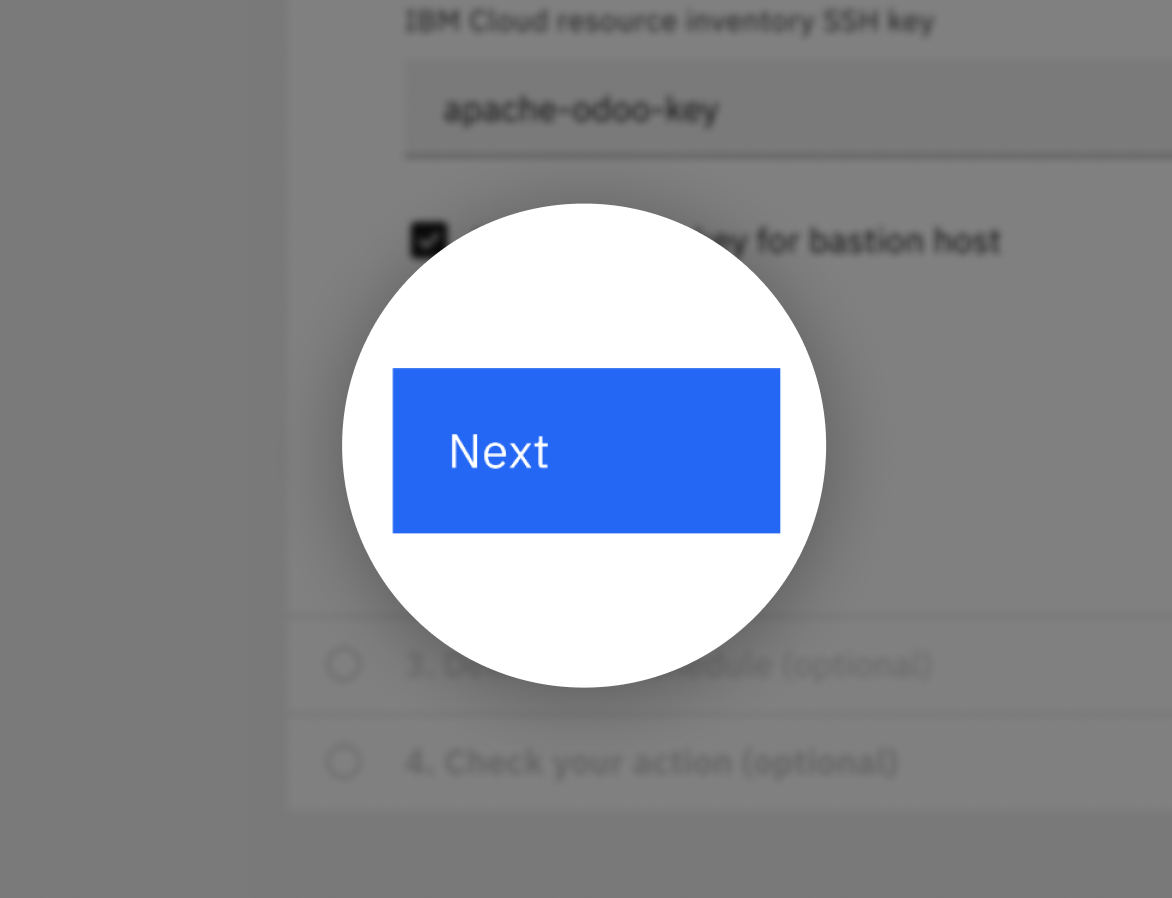
I changed the call to action from Save to Next. Again, this was done with the intention of instilling a sense of linear progression for the user. Save implies that you can edit any section you want, whereas Next implies that you must finish this section before you go to the next section.
Version 1
Version 2
I changed the edit icon to a chevron. This was done to eliminate the user’s sense of being overwhelmed with many sections to edit, and to promote the sense of situating oneself in a focused step in the context of a linear progression.
Final prototype
And *drumroll please* all of these explorations and high-fidelity changes resulted in this final prototype.